6 min read

-
Look # 1: Bold & Graphic
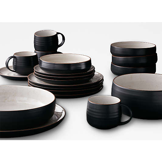
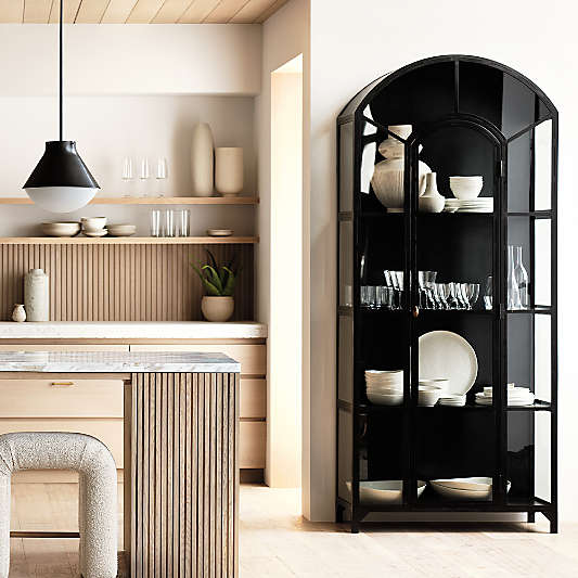
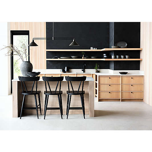
Every room in your home needs a jolt of black. Period. It makes a space feel deep, fresh and exciting. In this look, bold color brings attention to the silhouette of each accent, creating a fun and eye-catching visual mix I love. Keep reading to learn how I created the look.
ALWAYS MIX MATERIALS
I use different finishes to bring depth to a simple color palette. Velvet, wood and metal are a great combo to start with. Texture is the key to warmth, not color.
DRAW THE EYE WAY UP
Fact: Vertical lines make any room feel taller. In the kitchen, you can use tile to get this effect. Just lay it vertically instead of horizontally. This looks especially great in a contemporary kitchen.
MAKE IT WELCOMING
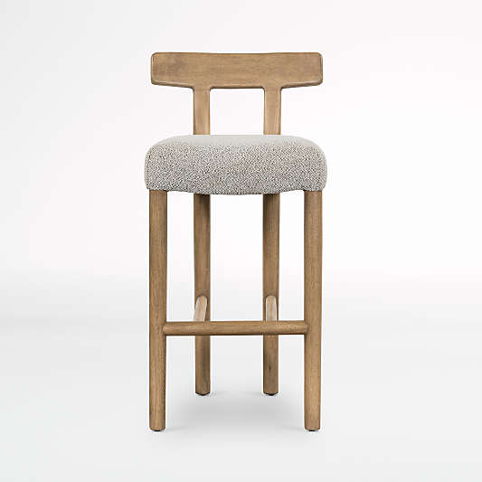
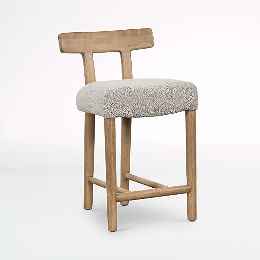
If your kitchen is always full of friends and family, surround your island with chairs that have a padded back. This instantly ups the comfy factor and invites them to stay and hang.
Paint: Sherwin-Williams Ibis White, Sherwin-Williams Conservative Gray
Tile: Clé Tile Weathered White zellige subway tile -
Look #2: Vintage Homage
So you want your kitchen to appear like it’s been curated over time. I’m with you. This timeless look will do it. It instantly brings a sense of history to a home, and because of its beautiful blend of classic styles, it will always be fashionable. Styling tips and tricks below!
PATINA IS YOUR FRIEND
If you have accents that show their age, now’s your chance to use them. If not, reach for hardware, lighting and decor with a bit of beautiful patina.
SHOW OFF YOUR PERSONALITY
Islands are a great way to make your kitchen feel personal. And don’t overthink it! They don’t have to match your cabinets. They should be siblings, even cousins, not twins.
THE MORE LIGHTING, THE BETTER
It’s so much easier to prep a meal when you can easily see everything, so make sure you have both overhead and accent lighting. A pendant and sconce mix is my favorite.
Paint: Sherwin-Williams Pure White
Tile: Clé Tile Casale Rustico -
Look #3: A Fresh Take On All White
All-white kitchens are timeless for one simple reason: they always feel crisp and clean. Here, I created a more relaxed version of the classic through simple shapes and a blend of modern finishes inspired by nature. Follow my tips below to get the look.
LESS IS MORE
Simple silhouettes reign supreme with this style because paring things back in this way creates beautiful visual flow.
LAYER TEXTURES
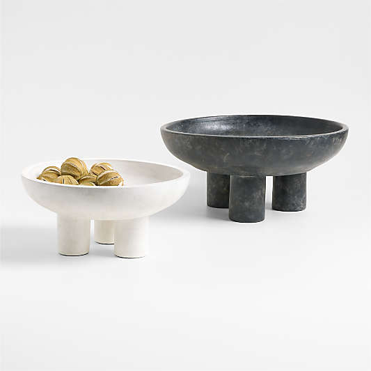
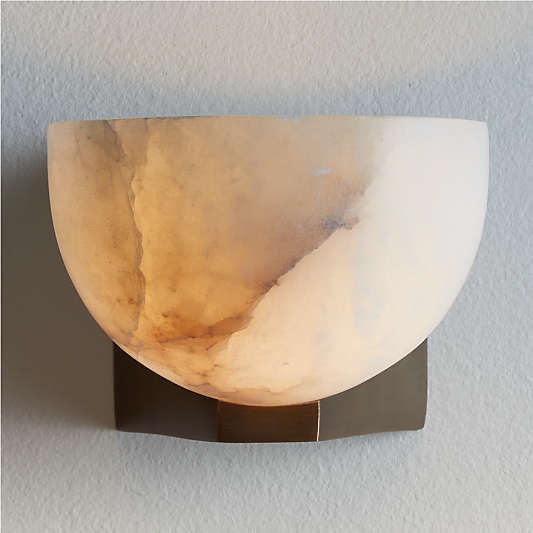
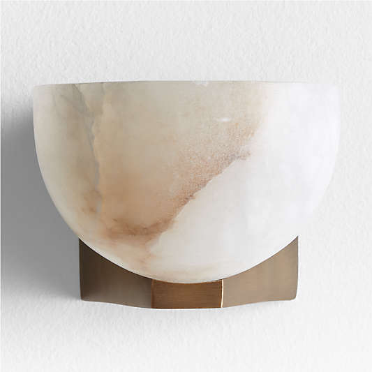
My trick for keeping neutral color palettes like this from falling flat? Incorporating subtle organic textures like glazed brick tile, warm white oak and handcarved alabaster stone.
CONSIDER A NEW TILE LAYOUT
When I don’t have color to play with, I add visual interest in other ways, like laying out tile in a grid formation. It seems like a small choice, but it really makes a home feel custom.
Paint: Sherwin-Williams Pure White
Tile: Clé Tile Weathered White zellige subway tile -
Look #4: Modern Farmhouse
Rustic texture and vintage-inspired furniture combine to make farmhouse kitchens so cozy and warm. I put my own modern spin on the classic aesthetic through rich color, a popular pattern (checkerboard for the win!) and a unique approach to mixing hardware and lighting. I break down how to create this look below.
PUT ONE COLOR ON REPEAT
Color is the easiest way to create a truly cohesive design. In this one, the deep blue tile, cookware and paint coordinate to pull the room together.
PLAY WITH PATTERN
Checkerboard is one of my go-to patterns because it feels traditional and modern at the same time. This makes it a great choice for the backsplash in this style of kitchen.
BALANCE COOL & WARM TONES
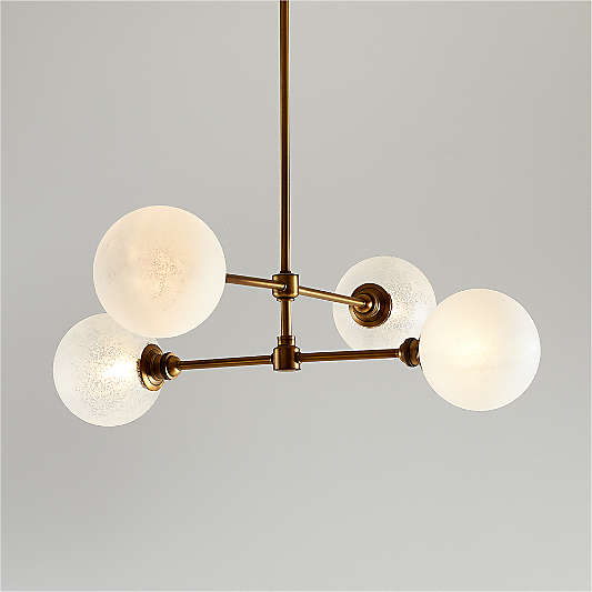
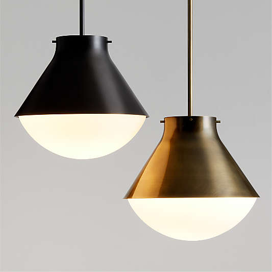
Brass and blue is a no-fail color combo I’ve been using for years, and these pendants look so beautiful while providing wonderful ambient light.
Paint: Sherwin-Williams Waterloo, Sherwin-Williams Origami White
Tile: Clé Tile Paste & Mallard bundle
